Art Direction/ Illustration/ Package Design all done by me.
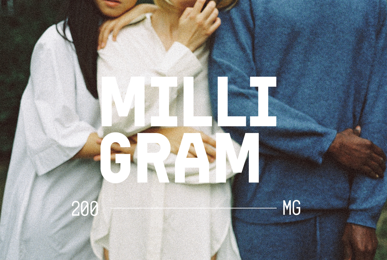
The creation of Milligram started from finding natural aesthetics. I approached the visual identity by observing flowing water over stone—symbolizing clarity amid chaos—while maintaining pharmaceutical rigor in the typography and layout. The supplement facts were structured for immediate comprehension, while the softer, muted palette of the packaging, each visual element was balanced: the bold "MILLIGRAM" wordmark provides authority, while the serif "Clarity" suggests personalized wellness. The Clarity gives a chance to people to savor their moments with other people. No anxiety, just enjoy your life!


